(Week Five) Interface Design Review

What is an interface?

Definition:

  • Common Boundary
  • Between things
  • A point of interaction
  • Medium across which data passes

The success of an interface design= transparency

  • To be noticed as an interface but not forgotten.
  • A transparent function of an interactive

Filtering out some hype (Interactivity: Ideologically and Historically)

  • Old Media = Passive Consumption  (1 producer to many viewers)
  • New Media = Interactivity (Many users collaborating with one another Web 2.0)

Contemporary Interactivity

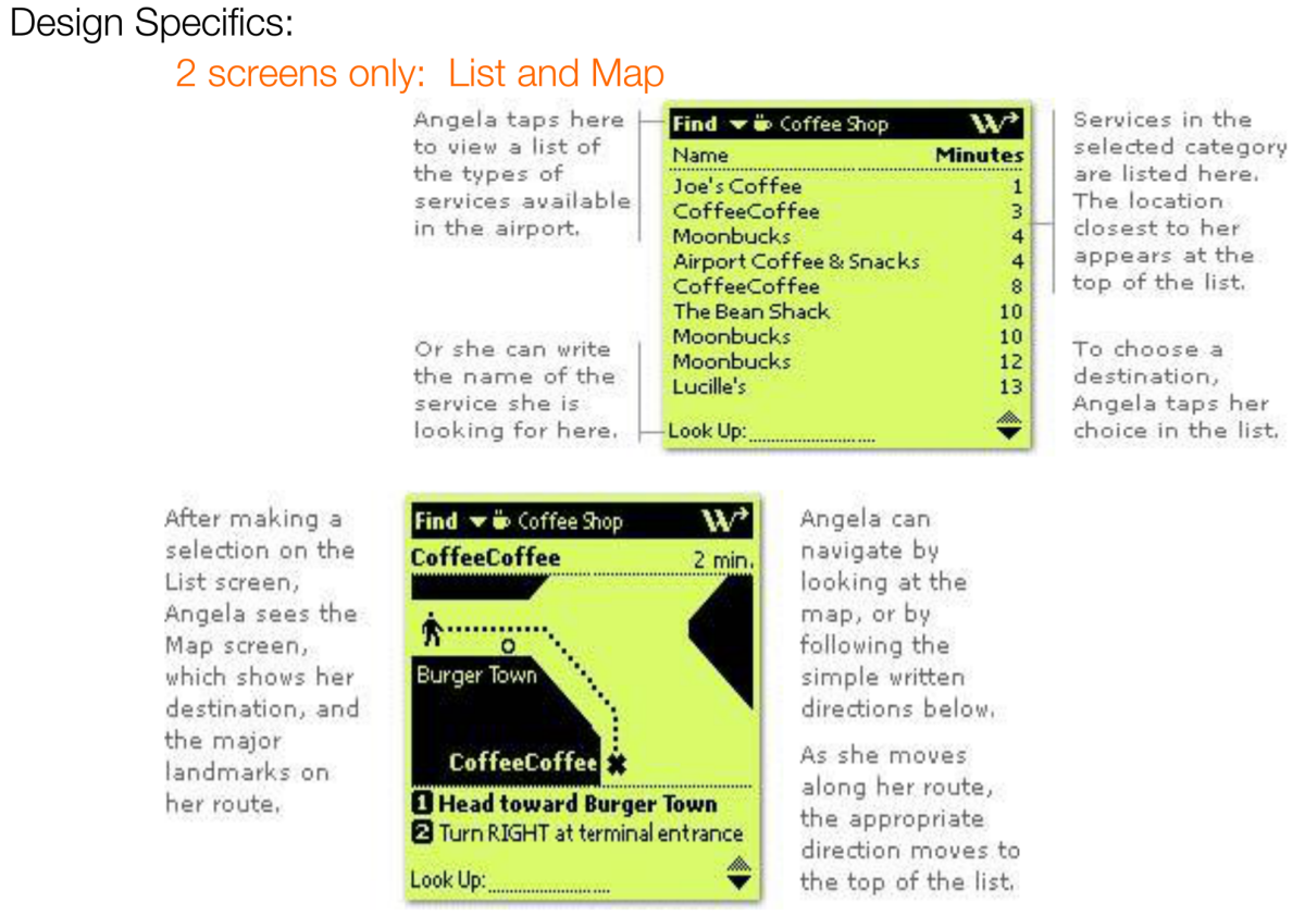
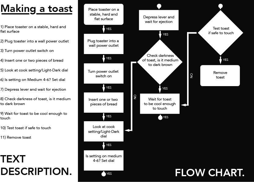
  • Hypertextual Navigation – The user has to make reading choices in a form or databases. Some example of this are the internet, adventure games or PC hard driv
  • Immersive Navigation –
  1. Hypertext = extractive
  2. Representations of space = Immersive
  3. Immersive media = Hypertext + represented space
  • Registrational Navigation – To write back into collective information, available for comment and response
  • Interactive Communications – based on face to face interaction (parallel)

 screen 16

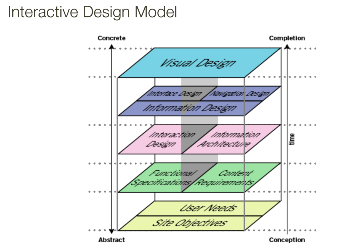
Fundamentals and Principals:

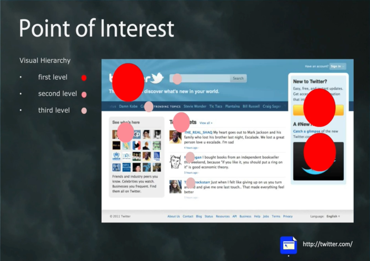
  • Visual Focus – Uses contrast to lead the users eye to the main focus, use animation to show functional or clickable objects, give contextual and visual cues greater visual distinction, creating styles to create similar format
  • Problem Solving – highlighting potential pathways by using breadcrumb trails, site maps, addition of navigation toolbars that suggest information  to users

an example sample of problem solving is by allowing users to filter the site.

screen 17


  • Contextual – provide detailed content in lower site levels, use shaded regions, tables or other methods to anchor navigation tools in consistent locations
  • Conceptual (Cognitive) – Use familiar icons and graphics that rely on prior user knowledge, place graphics in familiar contexts, provide text tags for images
  • Wholeness – group related content using visual shapes, use figure-ground contrast and grouping
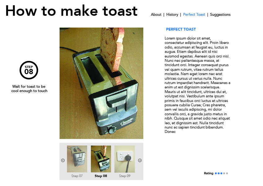
  • Linear/Nonlinear

screen 18


a linear interface is being controlled by the designer meaning its start to finish while a nonlinear gives the users the freedom to navigate the page on their liking

Reflection

Week five lecture made it clear to me the difference of interface and interaction and points some other points from the past lectures. This weeks lecture pretty much sums up and talks about the fundamentals and principles of an interactive design.

(Week Four) The static and kinetic screen

MODULE 1: Play, Experience, Design.

  • Static: Forces not causing movement (motionless)
  • Kinetic: Relating to change over time or motion

Andrew Polaine is an experienced designer focusing on playful interactions and service design research within the field of interactive concept development.

Interactivity through the concept of play:

  • Play > Experience > Design

According to Polaine interaction design is

screen 13


It is a combination of how the elements function

  • What they do – The purpose and function of an interactive
  • What they look like – The appearance and feel of your interactive
  • What they look like they do – clear visual distinction on interactive element
  • The experience of using them – The enjoyment of interacting with the design

It is about making complicated things easier and more enjoyable to use.

When experiencing kinetic content you transform from a viewer to a user.

User=

  • all senses and capacities, especially sight
  • view + use

MODULE 2 : Using what you know (Static Composition and Visual Hierarchy)

As design of media forms is evolving. Our design is also considered as evolving so rather than starting from scratch we should think about it as adding on what we already know.

To make an interaction a design less complicated it should be given a clear visual hierarchy.

Understanding visual hierarchy

The most important thing of a visual hierarchy is a Point of Interest.

What is a Point of Interest?

  • The focus point or draw card of a composition
  • Usually the most important element of a composition
  • The entry or starting point of reading or digesting visual information in a layout
  • Leader of visual hierarchy

As you can see in this image the designer made the twitter logo the sign-up and the video as the first level Hierarchy:

screen 14


as you can see on the image below our eyes automatically goes straight to the spots where the big red dots are. which are the logo, sign up and the video as shown on the image above. These spots are the most important as the users will know what website they are in, can find the sign-up button right away and the video to familiarise the users with the new twitter layout.

screen 15


Considering points of interest and levels of visual information: (Composition is visual ecology)

  • A point of interest should not overtake a whole composition
  • A point of interest should not be too weak and hidden
  • No right or wrong, only appropriates to purpose brief

Other methods of defining visual hierarchy:

  • Contrast – is the difference between visual elements within a work and it is the relative difference between light & dark areas
  • Tone – The relative lightness or darkness of a colour
  • Scale & Weight – The relative size of graphic form, closely related to perspective & depth
  • Colour
  • Typography – Legibility & Readability

Reflection

In designing we should combine elements to have a better function which are what they do, what they look like and what they look like to do. If we manage to nail this elements we have successfully designed an effective design. I have also learnt about the importance of the Hierarchy in the design process, this will help the users have a better experience in using your interactive design

(Week Three Part 2) Planning- Personas, Scenarios and Wireframes

Persona

  •  Persona’s are fictional archetypical users
  • If there is no expressed vision of your audience then it is not design

What is a scenario?

A scenario is a narrative describing imaginable interactions of types of users (characters) and the system. Scenarios include information about the goals, expectations, motivations, actions and reactions. A scenario is neither predictions nor forecasts but attempts to portray the way in which a system is used in the situation of daily activity.

Scenario Example:

Angela has a short 30 minute layover in a unfamiliar airport, she wants to grab a cup of coffee before she heads to her connecting flight, but doesn’t know where to go.

  1. Service maps are downloaded to phone
  2. Airport Guide shows where to find coffee shop
  3. Angela follows guides to coffee shop
  4. Angela uses Airport Guide to look up Connecting Flight
  5. Angela arrives at her gate on time


screen 10

Example of interactive design screen

screen 11

Persona 2: The designed Artefact Persona:

Can be most useful for a client meeting where it’s often a discussion falls One-sided insertions like I don’t like green, so developing an agreed personality your attempting to fill the product which gives everyone a context and objectively to evaluate the visual design and lets you get some discussion back on track if it were turning into subjectivity.

screen 12


How to develop a product persona?
Product personality questions:

  • If the interface were a person, what would she or he be like?
  • How would you expect users to react when they first view the product?
  • How would you describe this product to a friend?
  • How is the product different from competitive products?

Reflection

After this lecture I have learnt that we should have a persona (made up characters), Scenarios and Wireframes to base our designs. We should also brainstorm experience keywords to make our interactive more fun to use and more user friendly

(Week Three Part 1) The Interactive Design Process Overview

Part 1: Design Process Overview

  • Pre-project: This stage is where the Client brief is discussed with the client. This stage is also where the client and designer talk about the budget and schedule.
  • Concept + planning:  Summaries goals, messages and the audience through Flow chart and Research
  •  Design, Prototype + Specification: Workflow, Storyboard, User Testing
  •  Production: Functional Specifications, Finished Prototype
  • Testing: Launch, Test Report
  • Launch and Maintenance: Post Mortem, Style Guides, Archived Assets

This diagram is used to see the process of designing the interactive products.

screen 07


Here are some diagrams of a small interactive design agency might be set up.

screen 08


screen 09


Reflection

After this lecture I have learn’t about the process of making an interactive design. I have realized that you should first know who your target audience will be so that you will know what the feel and so that you will know what the design layout will look like. The designs should be about the audience not because the designer thinks it looks good.

(Week Two) Interaction Design & Interactivity Design.

In interactive design there are 5 key design areas that contribute to design these are:

  • Interactivity
  • Information Architecture
  • Time & Motion
  • Narrative
  • Interface

These key areas are important because users will not be able to interact if there is no interface, and we cannot design an interface unless we sorted out the underlined information design first

screen 04

When designing you should have these three main questions:

  • How do you do
  • How do you feel
  • How do you know

What is cognitive? Cognition is how humans process information, how to perceive the world, what their internal mental model is of the outside world. A quote from Interaction Design (2002) states that “Designing interactive products to support people in their everyday and working lives” – Sharp, Rogers & Preece.  We use interactive design everyday but we are probably unaware. We use interactive design through mobile phones, vending machine, online shopping website. Interaction can be done through taste, smell, ears, touch or eyes.

screen 05

Interactivity can include the amount of control the users or audience have over the tools, page or content of the product. Here is a diagram that shows us the flow from data to Wisdom

screen 06

How to design a good interactive design:

  • Understand your audience
  • What their needs and expectations are
  • How to meet them

Reflection

Interaction design is a broad range of concepts and design forms. I learnt that in order to build a successful interaction design you would need to think on what how the audience will feel while using it, what they will think and if it is user friendly

3 Screen grabs – Interactive Web 2.0 Examples

A few websites that are considered as web 2.0 are Flicker, Pinterest and Youtube. These websites became successful because it allows the users to interact with other people and the website.

  • Flickr – Flickr is built mainly for photographers to post their images. this website allows users to submit their photographs, comment and rate fellow photographers piece of work as well.
  • Screen Shot 2014-03-04 at 7.39.22 pmPinterest – Pinterest is basically like a pin board where users can pin things and ideas to share with other users. Other people can view pinned stuff through the different categories and might help them get or start any idea.
  • Screen Shot 2014-03-04 at 7.38.32 pmYoutube – Youtube is a website where users post videos and expose it to the world, if you are lucky your video can become viral and can get a lot of subscribers. This website became successful not only because they can share any videos online but when you reach a certain amount of subscribers you then become a Youtube partner which allows you to earn cash every time someone views your video.Screen Shot 2014-03-04 at 7.38.41 pm